In 2021, FC Drita, one of Kosovo’s most renowned football clubs, sought a logo redesign to modernize its identity while retaining its proud heritage. Tasked with this prestigious project, we embarked on an in-depth exploration of FC Drita’s history and core values, ensuring the new logo would reflect the club’s longstanding tradition and its vision for the future.
Design Approach
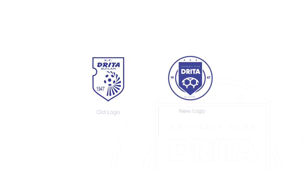
Our primary goal was to create a logo that symbolized both the past and future of FC Drita. The original logo, used for many years, was iconic but lacked the modern aesthetic necessary for a football club striving for excellence both locally and internationally.
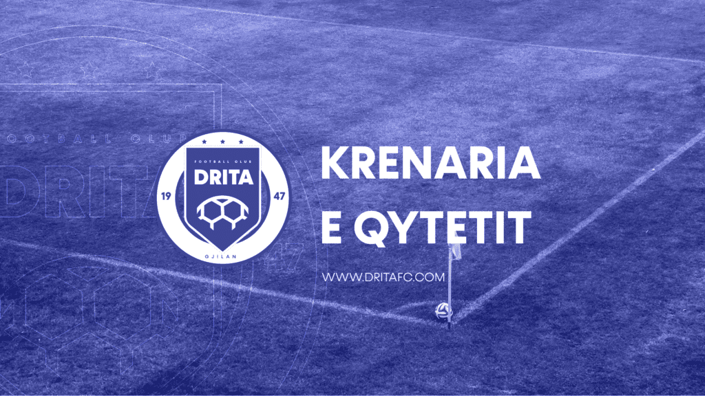
Key Design Elements:
- Hexagonal Structure: Central to the new logo is the hexagonal shape that represents strength, unity, and community. This shape evokes the idea of teamwork, symbolizing the core essence of any successful football club.
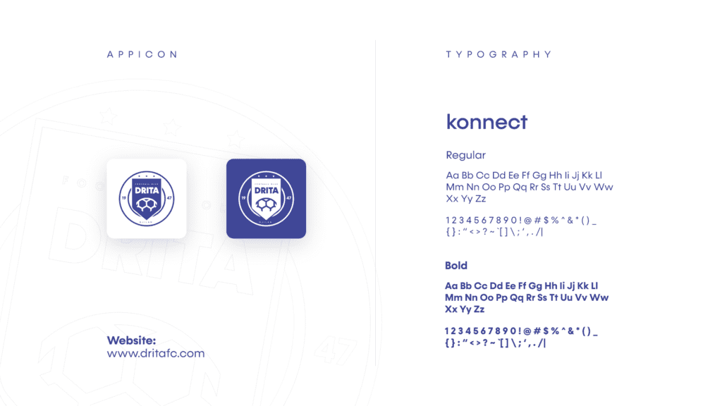
- Bold Typography: We chose “Konnect” as the typeface to reflect modernity while maintaining legibility and professionalism, key characteristics for a football brand.
- Color Palette: The distinct blue and white palette was retained but made more vibrant, symbolizing both stability and innovation. Blue represents the club’s calm confidence, while white adds a sense of clarity and forward-thinking vision.
- Star Accents: Three stars were added to highlight the club’s championship achievements, reinforcing its legacy within the football community.
Enhancing Brand Versatility
The redesign extended beyond just a new crest. We crafted versatile logo applications, including an app icon, digital branding assets, and various marketing materials. This was critical as FC Drita engages with a global fan base across digital platforms. The clean, adaptable design ensures that the new logo performs well in various formats and media, from merchandise to mobile apps.
Implementation and Results
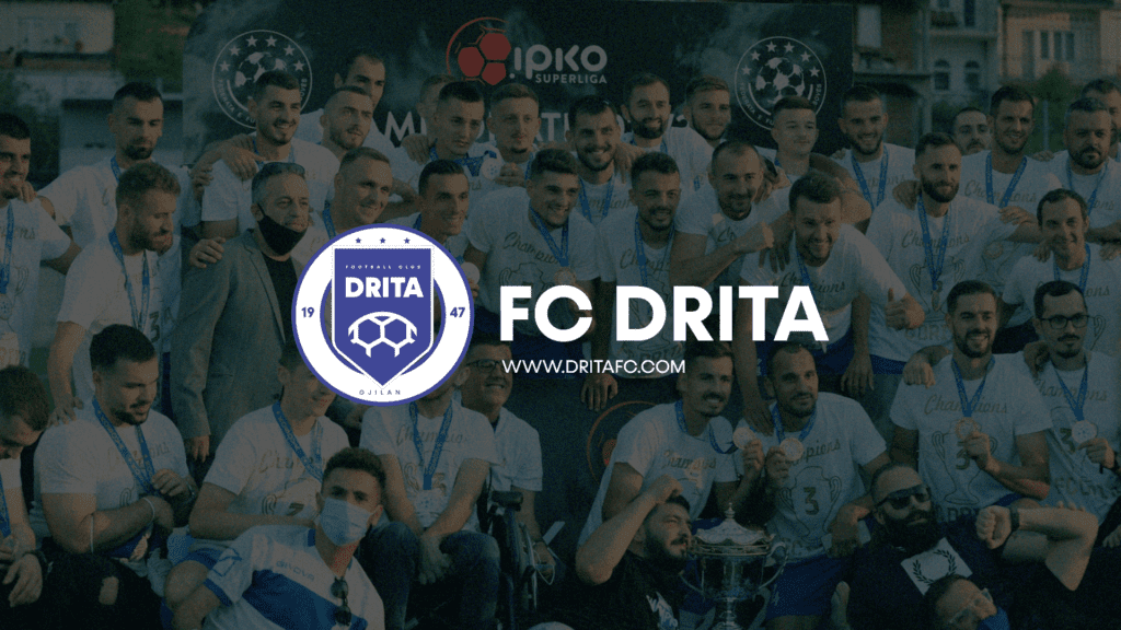
Once the new logo was finalized, it was rolled out across FC Drita’s online platforms, merchandise, and stadium banners. The feedback from the club’s fans and stakeholders was overwhelmingly positive, appreciating the blend of tradition with modern design elements.
The new identity has since played a significant role in strengthening FC Drita’s brand, both locally and internationally, solidifying their image as a top-tier football club.
Conclusion
The FC Drita logo redesign serves as an excellent example of how modern design can honor tradition while propelling a brand into the future. By integrating symbolism with a clean and versatile aesthetic, we helped FC Drita establish a visual identity that matches its ambitions and legacy.


