In short
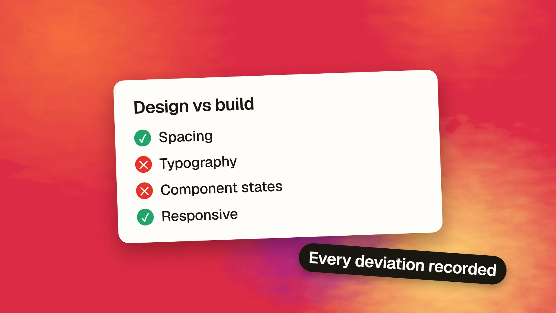
Design QA, or design review of the build, is the step in which a designer compares the implemented product with the design specification and records every deviation: spacing, typography, colour, alignment, component states, responsive behaviour, motion, copy and empty and error states, across real devices and browsers. It happens on a staging build before release and after each significant change. It is distinct from functional testing, which checks that things work, and it is most effective when findings are logged with severity, when the design system reduces what can drift, and when designers review early builds rather than finished ones.
What it is for
A design, however carefully specified, is an intention. The build is what happened. Between them are hundreds of small decisions a developer made, correctly or not: a margin that was 24 in the design and 20 in the code, a heading one step too small, a hover state nobody specified, a button that wraps to two lines on a phone, an empty state that shows raw text instead of the designed message. Each is minor; together they are the difference between a product that looks considered and one that looks assembled.
Design QA is the systematic comparison of build against intent, by the person who held the intent. It is not a criticism of the developer; it is the last step of design, and a build that has not been through it has not been finished.
| Where | Expected | Actual |
|---|---|---|
| Card padding | 24px | 18px |
| Heading weight | 500 | 600 |
| Button, hover | Darker blue | No change |
| Empty state | Illustration and action | Blank |
When it happens
On the staging build, before release, once features are functionally complete. Earlier reviews of partial builds catch systemic problems, such as a wrong spacing token, before they are repeated across every screen. Later reviews after each significant change or content update catch regressions. A single review at the end of a large project finds so much that the list overwhelms; short reviews throughout find less each time and keep the build close to the design.
The checklist
Tokens. Colours, type sizes, weights, line heights, spacing steps and radii match the design tokens, not approximations of them. A colour that is nearly right is wrong.
Layout. Alignment to the grid, consistent gutters, correct maximum widths, elements that line up with each other as designed.
Typography. Correct fonts loaded, fallbacks not showing, hierarchy preserved, line lengths within range, no orphaned words in headings where avoidable, correct punctuation and casing.
Components and states. Every interactive element in every designed state: default, hover, focus, active, disabled, loading, error, selected. Focus states are the most commonly missing.
Content states. Empty, single item, many items, overflow, long text, missing image, the designed empty and error states rather than blank space or raw messages.
Responsive behaviour. Every template at phone, tablet and desktop widths and the in-between widths where layouts strain; images cropped as intended; nothing overflowing.
Motion. Transitions and micro-interactions at the specified timing and easing, and disabled under reduced-motion settings.
Copy. The words in the build match the final copy; placeholder text is gone; capitalisation and terminology follow the guidelines.
Imagery and icons. Correct assets, correct sizes, no stretched or blurry images, consistent icon weights.
Cross-browser and device. Real iPhone and Android, Safari and Chrome at minimum, since rendering differs and design tools show only one.
Accessibility checks overlap, and many teams combine them; contrast, focus visibility and touch target size belong in both. Functional testing, whether things work, is a separate discipline covered in pre-launch testing, and design QA assumes it has happened.
Logging findings
Each finding gets a screenshot, the location, what was expected, what was built, and a severity: blocking (wrong content, broken layout on a common device), major (wrong component state, inconsistent spacing across a template), minor (a few pixels, a hover timing). Log them in the same tracker as bugs, so they are prioritised alongside functional issues rather than in a separate document nobody opens. Group systemic findings, such as a wrong token, into one item with the fix at the source, rather than logging every occurrence.
The tone matters. Findings are stated as differences from the specification, not as opinions about the developer's work, and where the specification was unclear, the finding is a specification fix as much as a build fix.
What it costs
A thorough first pass on a mid-sized site takes a designer a day or two; follow-up passes take hours. Against a build of several weeks, that is a small share, and it is the share that decides whether the work looks like the design that was approved.
Reducing the need for it
Most design QA findings are avoidable upstream. A design system implemented in code, with tokens and components matching the design library, removes whole categories of drift: if the only button is the system button, its spacing cannot be wrong. Specifications that include states, responsive behaviour and content variants leave less to guess. Designers and developers reviewing work in progress together, rather than at handoff and at the end, catch misunderstandings when they are cheap. And visual regression tests on the component library catch unintended changes without a human looking.
Design QA on a mature system finds little, which is the goal; on a project without one, it finds the case for building one. If your builds keep arriving with the same categories of deviation, book a call; the fix is usually in the system and the handoff rather than in more review.
Common questions
What is the difference between design QA and QA testing?
QA testing checks that the product works: features function, forms submit, nothing breaks. Design QA checks that the product matches the design: spacing, typography, colour, component states, responsive layout, motion and copy are as specified. Both happen on a staging build before release; design QA assumes functional testing has already passed.
Who is responsible for design QA?
The designer who produced the specification, since they hold the intent the build is compared against, usually with a developer present to discuss findings. On teams without a dedicated designer, whoever owns the design system does it. It should not fall to the developer alone, who cannot see the gap between what they built and what was meant.
When should design QA happen?
On the staging build once features are functionally complete and before release, with earlier reviews of partial builds to catch systemic problems such as a wrong token before it spreads, and follow-up reviews after significant changes. Short, frequent reviews find less each time than one large review at the end and keep the build closer to the design.
What should a design QA checklist include?
Tokens (colour, type, spacing, radii), layout and alignment, typography and font loading, every component state including focus and disabled, content states such as empty and overflow, responsive behaviour at multiple widths, motion and reduced-motion behaviour, final copy, imagery and icons, and checks on real iOS and Android devices in Safari and Chrome.
How do you reduce the number of design QA issues?
Implement the design system in code with tokens and components matching the design library, so most drift becomes impossible; specify states, responsive behaviour and content variants in the handoff; review work in progress together rather than only at the end; and add visual regression tests on the component library. A mature system produces few findings, which is the goal.