In short
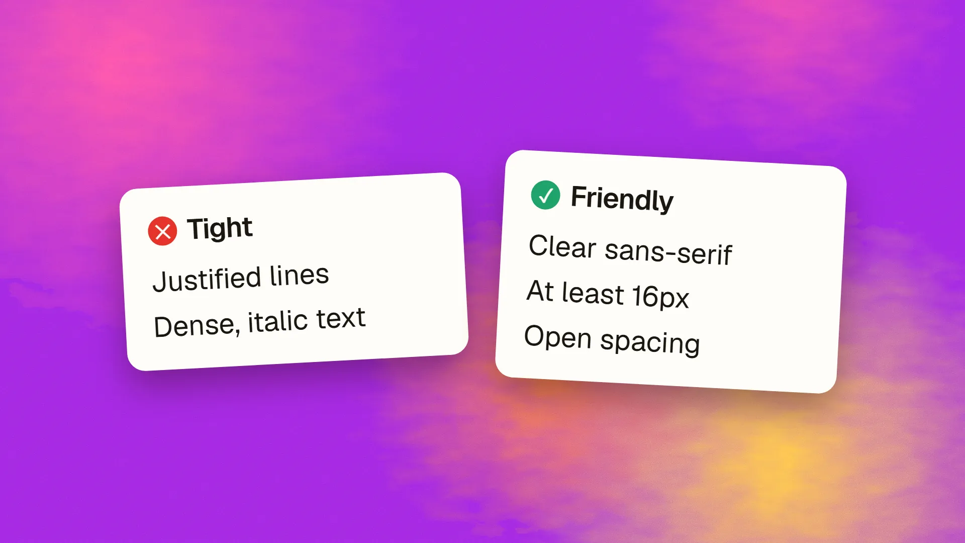
Dyslexia-friendly design uses typography, spacing, layout and language choices that reduce the visual and cognitive effort of reading for people with dyslexia, who make up roughly 10% of the population: a clear sans-serif at 16px or larger, generous line spacing around 1.5, letter and word spacing slightly increased, short lines, left-aligned ragged-right text, no justified text or italics for emphasis, off-white backgrounds instead of pure white, short paragraphs and plain language. Specialist dyslexia fonts have little evidence of benefit over good standard fonts. Every one of these changes improves reading for everyone.
What dyslexia affects
Dyslexia is a difference in how the brain processes written language, affecting reading fluency, decoding and spelling rather than intelligence or comprehension of ideas. Estimates put it at around one in ten people, with a spectrum of severity. For reading on screens, the practical effects include letters and words appearing to move, blur or merge; losing the place at the end of a line; difficulty with dense or crowded text; sensitivity to high contrast and bright white backgrounds; and fatigue from sustained reading. Design cannot change the underlying processing, but it can reduce the visual load that makes those effects worse.
The evidence-based guidance
The British Dyslexia Association's style guide, supported by research on reading performance, is the standard reference, and its recommendations are specific:
Typeface. A clear sans-serif with distinct letterforms, so that similar letters (b and d, p and q, l and I) are easy to tell apart, and with even spacing. Arial, Verdana, Tahoma, Open Sans and similar are recommended. Avoid decorative and script faces.
Size. At least 12 to 14 point in print, which corresponds to 16px or larger on screen, and ideally a way for the reader to enlarge it.
Spacing. Line spacing of about 1.5; slightly increased letter spacing (up to about 35% of the average letter width) and word spacing (around 3.5 times the letter spacing); paragraph spacing larger than line spacing. Research consistently finds that increased spacing is the single most effective adjustment.
Alignment. Left-aligned with a ragged right edge. Justified text creates uneven gaps between words, called rivers, which disrupt reading.
Emphasis. Bold rather than italics or underlining, which distort letterforms. Avoid all capitals and text in capitals for more than a word or two.
Contrast and colour. Dark text on an off-white or cream background rather than black on pure white, which many dyslexic readers find glaring; sufficient contrast without maximum contrast. Avoid text over images and patterned backgrounds.
Line length. Around 60 to 70 characters, so the return sweep to the next line is short.
Structure. Short paragraphs, clear headings, lists for lists, plenty of white space, and consistent layout.
The special fonts
OpenDyslexic, Dyslexie and similar typefaces weight the bottoms of letters and exaggerate distinctions between similar shapes, on the theory that this stops letters flipping or rotating. They are popular with some readers, and readers who prefer them should be able to use them. But controlled studies have generally found no reading-speed or accuracy advantage over standard fonts such as Arial or Verdana, and some found them slower. The benefit that appears in testimonials is often the spacing those fonts ship with, which can be applied to any font. The evidence-based recommendation is a good standard sans-serif with generous spacing, and the freedom for users to substitute their own preference through browser settings.
Layout and content
Beyond typography, the reading load comes from structure and language. Plain language helps enormously: short sentences, common words, one idea per sentence, the point first. Headings that summarise sections let readers navigate without reading everything. Lists break up dense information. Consistent placement of navigation and controls reduces the search for them. Multi-column layouts, which force the eye to jump, should be avoided for body text. Timed content and moving text are barriers. Offering audio or text-to-speech compatibility, which means real text rather than text in images, helps readers who prefer to listen.
Forms deserve care: clear labels above fields, no reliance on spelling for validation where possible (a postcode lookup rather than a typed address), forgiving input, and error messages that say what to do.
Why it helps everyone
None of these recommendations is specific to dyslexia. Generous spacing, comfortable size, short lines, left alignment, off-white backgrounds and plain language improve reading speed and comprehension for the general population, for older readers, for people reading in a second language, and for anyone on a phone in bright light. The line height and body size guidance for the web in general arrives at the same numbers. Dyslexia-friendly design is not an accommodation added to a design; it is the design done properly, with the margin for error set a little wider.
The practical checklist
Sans-serif with distinct letterforms; 16px or larger; line height 1.5; slightly open letter and word spacing; 60 to 70 characters per line; left-aligned; bold for emphasis; off-white background with strong but not maximum contrast; short paragraphs and lists; plain language; real text, never text in images; user control over size, and no CSS that blocks browser font overrides. A site that meets these is readable by a far larger share of visitors than one that does not, and it looks calmer for it. If you would like a readability pass on a site, book a call; most of the changes are token-level and quick to apply.
Common questions
What is the best font for dyslexia?
A clear standard sans-serif with distinct letterforms and even spacing, such as Arial, Verdana, Tahoma or Open Sans, at 16px or larger with generous spacing. Specialist fonts such as OpenDyslexic are preferred by some readers but controlled studies have found no general advantage over standard fonts; the spacing matters more than the typeface, and readers should be able to substitute their own preference.
What line spacing is best for dyslexic readers?
Around 1.5 times the font size for body text, with paragraph spacing larger than line spacing and slightly increased letter and word spacing. Research consistently finds that opening up spacing is the most effective single adjustment for dyslexic readers, and it improves reading for everyone.
Should text be justified for accessibility?
No. Justified text creates uneven gaps between words that form distracting rivers through paragraphs, which disrupt reading for dyslexic readers in particular. Use left-aligned text with a ragged right edge, and keep line length around 60 to 70 characters.
What background colour is best for dyslexia?
An off-white or cream background with dark text, rather than black on pure white, which many dyslexic readers find glaring. Contrast should meet accessibility requirements without being maximal. Avoid placing text over images or patterned backgrounds, and consider offering a choice of colour schemes.
Does dyslexia-friendly design help people without dyslexia?
Yes. Generous spacing, comfortable size, short lines, left alignment, softer backgrounds and plain language improve reading speed and comprehension across the general population, and particularly for older readers, people reading in a second language and anyone reading on a phone. The recommendations coincide with good typographic practice generally.