In short
Progressive disclosure is a design technique that presents the essential options and information first and reveals secondary detail only when the user asks for it, through patterns such as expandable sections, 'show more' links, advanced settings panels, multi-step forms and drill-down navigation. It reduces cognitive load and error rates for the majority who need only the basics while keeping full capability available. It fails when essential things are hidden, when the path to the hidden content is not obvious, or when the disclosed layer is itself cluttered.
The principle
Most users of most features need a small subset of what the feature can do, most of the time. Progressive disclosure puts that subset in front of them and moves the rest one step away: behind a link, a toggle, a tab, a second screen. The interface starts simple, and complexity is available on demand rather than imposed on arrival.
The term comes from Jakob Nielsen's usability work in the 1990s, though the practice is older. The research support is consistent: interfaces that stage complexity are learned faster, produce fewer errors, and are rated as easier, while still satisfying expert users once they know where the depth lives. It is one of the most reliable ways to reduce cognitive load without removing capability.
The patterns
Expandable sections and accordions. A heading that opens to reveal content. Right for FAQs, settings groups and reference material where users scan for one item.
Show more and read more. A truncated block with a link to expand. Right for long descriptions, comment threads and lists where the first few items usually suffice.
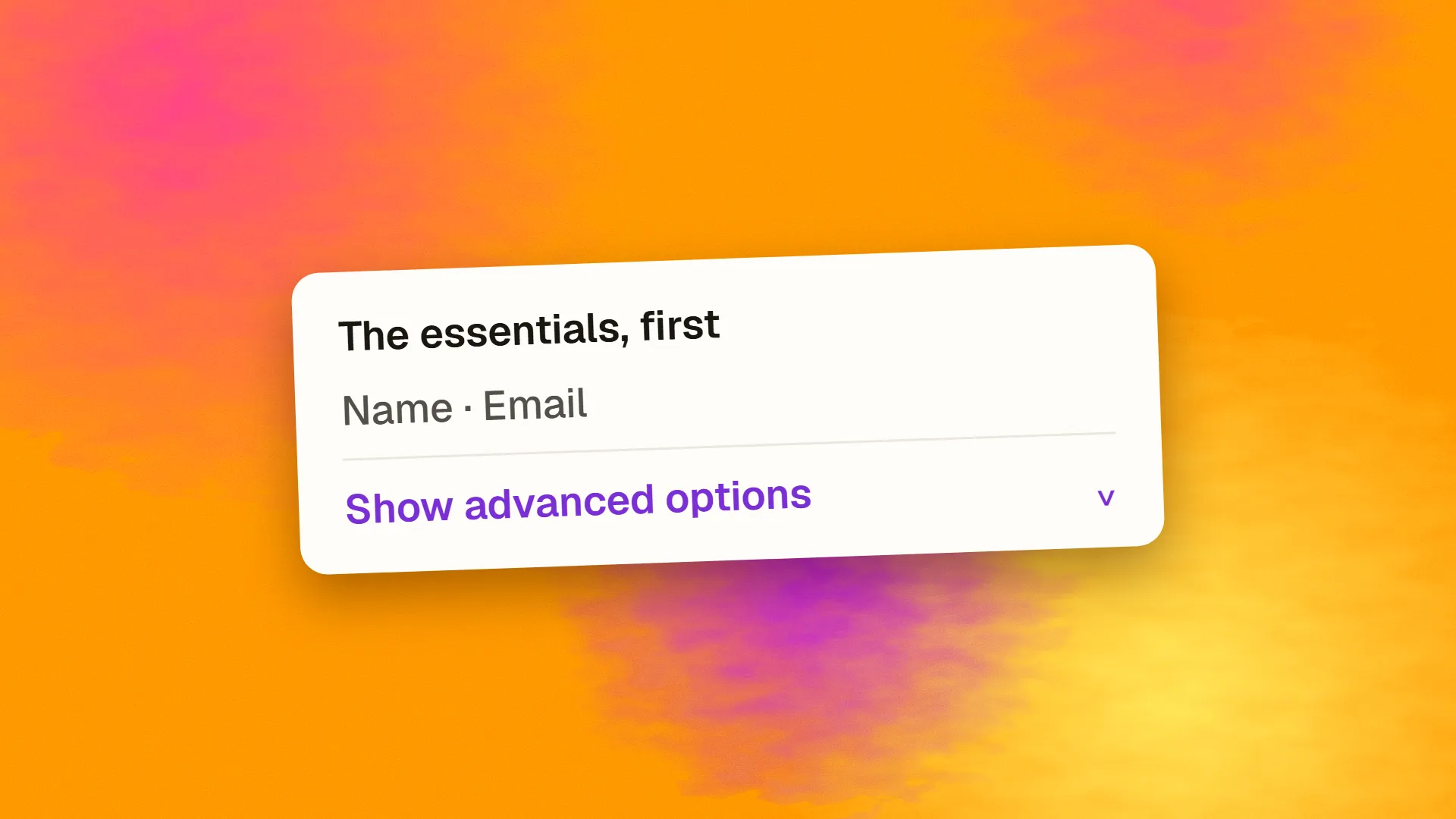
Advanced or more options. A form or dialog showing the common fields, with a link or toggle revealing the rest. Right whenever a minority needs the extra controls.
Multi-step forms and wizards. One decision per screen, in sequence. Right for long processes where later steps depend on earlier answers, such as checkout and onboarding.
Tabs and drill-down. Overview first, detail on selection. Right for dashboards, product pages and data tables.
Contextual and hover details. Tooltips and popovers for supplementary information, with the caveat that tooltips fail on touch and must never hold essentials.
Staged onboarding. Teaching features when they become relevant rather than all in a tour on day one.
Menus. The oldest form: the top level shows categories, each opening to items.
Why it works
The first screen carries fewer elements, so it is scanned faster and the important action is easier to find. Users who need only the basics are never confronted with options they do not understand, which is where hesitation and errors originate. Users who need more find it where they expect it, and having asked for it, they are ready to engage with it. And the interface can grow in capability without growing in apparent complexity, which is what lets a product serve newcomers and experts with one design.
Where it goes wrong
Hiding essentials. A price, a deadline, a cancellation condition, a required field, behind an expander most users will not open. Progressive disclosure is for secondary information; anything a user must see stays visible.
Unclear paths. A "more" that users do not notice, an expander with no affordance, a settings panel three levels down. If the hidden content is needed by a meaningful share of users and they cannot find it, the design has traded confusion for invisibility.
Too many layers. Options behind options behind options. Two levels is usually the useful limit; beyond that, users lose track of where they are.
A cluttered second layer. Hiding forty options behind "advanced" does not organise them; the disclosed panel needs the same design attention as the first screen.
Disclosure as a substitute for decisions. Putting everything behind expanders because the team could not agree what mattered. The technique depends on knowing what most users need, which is a research question.
Content that should be indexed. Search engines do read content in collapsed sections, but content hidden by default can be treated as less prominent; anything that matters for search should not depend on a click to be read.
Deciding what to show
The question for every element is: what share of users need this, and how often? Usage analytics answer it for existing products; interviews and task analysis answer it for new ones. Elements most users need on most visits stay on the first screen. Elements a minority need go one step away, with a clearly labelled path. Elements almost nobody needs may not need to exist. Defaults handle much of the rest: a well-chosen default is an option nobody has to see.
Then watch the paths. If the "advanced" link is used by a majority, the split is wrong and something should move up; if it is never used, the hidden options may be unnecessary. Usability testing with tasks that require the hidden layer shows whether people can find it.
Doing it well
Label the path to the hidden content with what it contains, not "more" alone. Give expanders a visible affordance and a clear open state. Keep the first layer genuinely useful on its own. Remember what the user opened, so returning experts do not have to re-expand every time. Keep the layers to two where possible. And make sure the collapsed state is accessible: expanders as buttons with the right attributes, keyboard-operable, and announced to screen readers.
Progressive disclosure is how a product avoids the choice between simple and powerful. If yours feels like it has made that choice and picked the wrong one, book a call; restructuring what shows first is often a small change with a large effect.
Common questions
What is progressive disclosure in UX?
A technique that shows users the essential options and information first and reveals secondary detail only when they ask for it, through expanders, show-more links, advanced settings, multi-step forms and drill-down navigation. It keeps the first screen simple for the majority while keeping full capability available for those who need it.
What is an example of progressive disclosure?
A search page with a few filters visible and an 'all filters' link; a form with common fields shown and an 'advanced options' toggle; a checkout split into shipping, payment and review steps; an FAQ as an accordion; a settings screen with basic controls and a link to advanced ones. Each shows the common case and defers the rest.
What are the risks of progressive disclosure?
Hiding something essential behind an expander users will not open, paths to hidden content that are not noticed, too many layers so users lose their place, a second layer as cluttered as the first would have been, and using it to avoid deciding what matters. It should conceal only what most users do not need.
Does hidden content in accordions hurt SEO?
Google reads content in collapsed sections and indexes it, and has said such content is fine on mobile-first pages. Content hidden by default may carry a little less weight than visible content in some assessments. Keep anything central to the page's topic visible, and use accordions for supplementary material such as FAQs.
How do you decide what to show first and what to hide?
By how many users need each element and how often, from analytics for existing products and from interviews and task analysis for new ones. Frequently needed items stay visible, minority needs go one clearly labelled step away, and rarely needed items may be removed or handled by defaults. Then check the paths with usability testing and usage data.