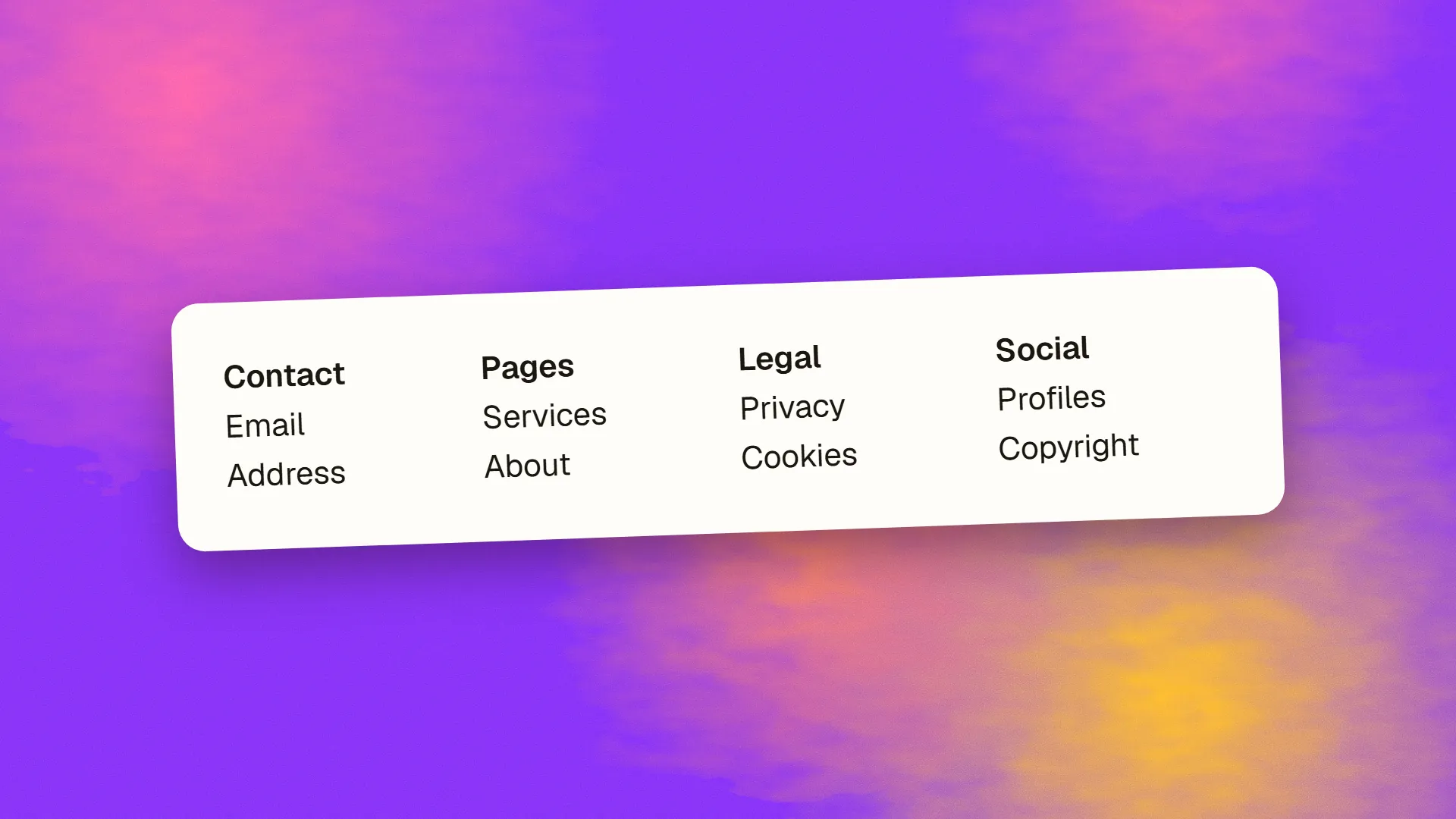
In short
A footer should contain the things visitors expect to find at the bottom of any site: contact details and a physical address, links to the main sections and to pages the header omits, legal links such as privacy, terms and cookie preferences, copyright and company registration details where required, social profile links, and, for sites that publish, a newsletter sign-up. It should not repeat the entire sitemap, carry keyword-stuffed link lists, or hide essential information in tiny type. Mark it up as a footer landmark and keep its links crawlable.
What the footer is for
A visitor scrolls to the bottom of a page for one of a few reasons: they finished the content and want to know what to do next, they did not find what they wanted and are looking for a way to contact someone or find another section, or they want to check who is behind the site before trusting it. The footer serves those three visitors. Everything in it should be there for one of them.
It is also the one element on every page, which gives it a structural role: it is where crawlers find the links to sections that are not in the header, and where the details that establish the site as a real business live.
What belongs
Contact and location. An email address, a phone number if you take calls, and a physical address. For a local business, the address in the footer supports local search and reassures visitors that the business exists somewhere. Mark it up so it is readable, not an image.
Navigation. The main sections, and the pages that matter but did not earn a place in the header: about, careers, press, help, documentation, a sitemap. Grouped into short columns with headings. This is where a site's secondary structure lives.
Legal links. Privacy policy, terms, cookie preferences or a way to reopen the consent dialog, accessibility statement, and any sector-specific disclosures. These are expected, sometimes required, and the footer is where every visitor knows to look.
Identity. A copyright line, and, where the law requires, the registered company name, number and address; several countries mandate these on business websites.
Social profiles. Icons linking to the profiles the business actually maintains, not to every network.
A next step. A newsletter sign-up, a contact prompt or a small call to action, for the visitor who finished the content and is ready. Not a full form for every page; a line and a button.
Trust marks, where relevant: payment methods on an e-commerce site, certifications and memberships, awards that mean something to customers.
What does not belong
The entire sitemap, with every product and post, which turns the footer into a wall and dilutes its links. Keyword-stuffed lists of locations and services intended for search engines rather than visitors, which Google has discounted for years and which read as spam. Repeated content from the header, unless the page is long enough to justify it. Essential information in 10-pixel grey type that fails contrast. Auto-playing anything. Decorative maps that cannot be interacted with. A second logo the size of the first.
Fat footer or minimal
A large footer with several columns of links suits sites with many sections, e-commerce, and content libraries, where the secondary navigation is genuinely useful and the footer serves as a directory. A minimal footer with contact, legal and a few links suits small business sites, landing pages, portfolios and applications, where a large footer would be padding. The test is whether each link would be missed; if a column is there because footers have columns, remove it.
On mobile, columns stack, so a fat footer becomes a long scroll; collapse the groups into accordions or shorten them.
Markup and SEO
Use the footer element, which provides a landmark that screen-reader users can jump to and skip. Put links in lists with headings for each group. Keep the links as ordinary anchors so they are crawled; footer links pass internal-link value, which is why the pages linked there should be the ones that deserve it. Contact details can carry Organization or LocalBusiness structured data, though the head of the page is the more usual place for it. Ensure the footer's text meets contrast requirements, since footers are the most common place on a site for faint grey text on a slightly less grey background.
A practical template
For a small business site: a column with the logo, a sentence about the business and the address; a column of main sections; a column of secondary pages; a column with contact details and social links; and a bottom bar with the copyright, legal links and cookie preferences. For a content site, add a newsletter line above the columns. For an application, contact, status page, documentation, legal, and nothing else.
Work
About
Street and city
Terms
Cookie preferences
The footer is the least glamorous part of a site and one of the most consistently used, and the sites that get it right treat it as a page of its own with a small brief. If yours has grown into a wall or shrunk into a copyright line, book a call; it is a quick restructure with a clear effect on how visitors find contact details.
Common questions
What should be included in a website footer?
Contact details and a physical address, links to the main sections and to secondary pages the header omits, legal links such as privacy, terms and cookie preferences, a copyright line with any legally required company details, social profile links, and a small next step such as a newsletter sign-up. Grouped into short columns with headings.
Do footer links help SEO?
Yes, as internal links: they pass value and help crawlers find pages not in the header, which is why the pages linked there should be the ones that deserve it. Keyword-stuffed lists of locations and services in the footer have been discounted by Google for years and look like spam to visitors; keep the links useful and modest.
How big should a website footer be?
As large as its useful content. Sites with many sections, e-commerce and content libraries suit a multi-column footer that acts as a directory; small business sites, landing pages and applications suit a minimal footer with contact, legal and a few links. Remove any column that exists only because footers have columns.
What legal information must a website footer include?
It depends on the country and sector, but privacy policy and terms links are near-universal, cookie preference access is required where consent applies, and many jurisdictions require the registered company name, number and address on business websites. Sector rules may add regulatory disclosures. Check the requirements for where the business is registered and where it sells.
Should the footer be the same on every page?
Generally yes, so visitors learn where to find contact and legal information once and crawlers see consistent site-wide links. Landing pages built to convert sometimes use a reduced footer with only the legal essentials, to avoid offering exits. Changing the footer per section is rarely worth the inconsistency.