In short
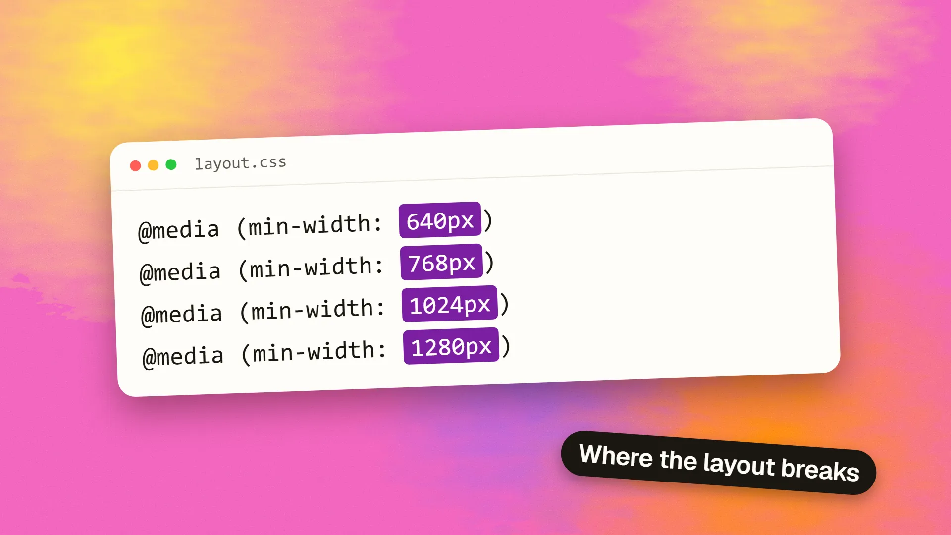
Choose breakpoints where the layout needs to change, discovered by resizing the design until it breaks, rather than at specific device widths. A practical default set for most sites is around 640, 768, 1024 and 1280 pixels, written as min-width queries in a mobile-first stylesheet, with fluid typography and spacing reducing how many are needed. Layouts should work at every width in between, not only at the breakpoints. For components that appear in different contexts, container queries let the component respond to its own space rather than the viewport.
Content, not devices
Early responsive design set breakpoints at the widths of popular devices: 320 for the iPhone, 768 for the iPad, 1024 for laptops. The device list is now hundreds of widths long, changes yearly, and includes foldables, split-screen tablets and browser windows at arbitrary sizes. Designing for specific devices designs for nobody.
The principle that replaced it: breakpoints go where the content breaks. Start with the layout at its narrowest, widen the viewport slowly, and watch. The point where line lengths become uncomfortably long, where a card grid could fit a second column, where the navigation has room to expand, is a breakpoint. It is determined by the content and the design, and it often lands at a number nobody would have guessed.
A practical default set
Most sites end up with a set close to this, expressed as min-width queries in a mobile-first stylesheet:
| Breakpoint | Typical change |
|---|---|
| Base (below ~640px) | Single column, stacked navigation, full-width elements |
| ~640px | Two-column grids, side-by-side form fields, larger type |
| ~768px | Sidebars appear, navigation expands, three-column grids |
| ~1024px | Full desktop layout, persistent navigation, wider measure |
| ~1280px | Maximum content width reached; further width becomes margin |
Tailwind, Bootstrap and most design systems use sets like this, and they work because they are spaced sensibly across the range of real viewports rather than because any device matches them. Use them as a starting point and move each one to where your own layout actually needs it.
Fewer is better. Every breakpoint is a layout to design, test and maintain. Three or four well-placed ones cover most sites.
Fluid layouts reduce the need
A breakpoint is a step. Fluid techniques make the steps smaller or remove them:
- Percentage and fractional widths so columns scale continuously.
clamp()for typography and spacing, so a heading grows smoothly from 28 to 48 pixels across the range instead of jumping at a breakpoint. A type scale built this way needs almost no queries.- Grid with
auto-fitandminmax(), which adds columns as space allows without any media query at all:grid-template-columns: repeat(auto-fit, minmax(280px, 1fr))produces one column on a phone and four on a wide screen by itself. - Flexbox wrapping, which lets items flow to the next line when they run out of room.
A layout built on these needs breakpoints only for structural changes, such as a sidebar appearing, and can leave everything else to flow. This is the difference between a site that works at every width and one that works at four.
Container queries
Media queries respond to the viewport. A card component, though, may sit in a wide main column on one page and a narrow sidebar on another, at the same viewport width, and it needs to respond to its own space. Container queries, supported in all modern browsers since 2023, do exactly that: a component declares its parent as a container and queries the container's width. The card becomes horizontal when its container is wide and stacked when it is narrow, wherever it is used.
For component-based design systems this is the more correct tool, and it reduces viewport breakpoints to the page-level structural decisions they should have been all along.
The in-between widths
A layout tested only at the breakpoints is broken at every width between them. Common failures: a two-column layout at 768 that becomes cramped at 800 as content grows; a navigation that fits at 1024 and wraps at 1100 when a menu item is added; a hero image cropped well at 375 and 1440 and badly at 900. Resize the browser slowly across the full range, test on real phones in both orientations, and check the widths where the layout is under most strain, just above each breakpoint.
Also design for the unexpected: a browser window at 1,100 pixels because someone is working in two windows, a foldable at 720 unfolded, a large tablet at 1,366 in landscape, and text zoomed to 200% for accessibility, which behaves like a narrower viewport.
Practical rules
- Start mobile-first and add breakpoints upward, at the widths where the content asks for them.
- Use a small standard set as a starting point and adjust to the content.
- Make everything fluid that can be, with
clamp(),minmax()and wrapping, so breakpoints handle structure only. - Use container queries for components that appear in different contexts.
- Name breakpoints by role, such as
--bp-sidebar, rather than by device. - Test continuously across the range, not at four points.
The grid versus flexbox question is mostly about which fluid tool fits which layout; the breakpoint question is about where the fluid tools run out. If a site looks right in the mockups and wrong at the widths real visitors use, book a call; it is usually a fluidity problem, not a breakpoint problem.
Common questions
What are the standard responsive breakpoints?
There are no official standards, but most frameworks and sites converge on a set close to 640, 768, 1024 and 1280 pixels, used as min-width queries in a mobile-first stylesheet. They work because they are spaced sensibly across real viewport sizes, not because devices match them. Adjust each to where your own layout actually needs to change.
How many breakpoints should a website have?
As few as the layout needs, typically three or four. Each breakpoint is a layout to design, test and maintain. Fluid techniques such as percentage widths, clamp() for type and spacing, and grid auto-fit reduce the need, leaving breakpoints for structural changes such as a sidebar appearing.
Should breakpoints be based on device sizes?
No. Device widths are numerous, change yearly and include foldables and arbitrary browser windows. Set breakpoints where the content and layout break as the viewport widens: where line lengths become too long, where a grid can gain a column, where navigation has room to expand. Test across the full range, not at device widths.
What is the difference between media queries and container queries?
Media queries respond to the viewport width. Container queries respond to the width of a component's own container, so a card can be horizontal in a wide column and stacked in a narrow sidebar at the same viewport size. Container queries are supported in all modern browsers and suit component-based design systems.
Should I use min-width or max-width media queries?
min-width, in a mobile-first stylesheet: base styles target small screens and each query adds layout for wider viewports. max-width queries, used desktop-first, write the full layout and then override it downward, which produces more CSS and more rules for phones to parse and discard.