In short
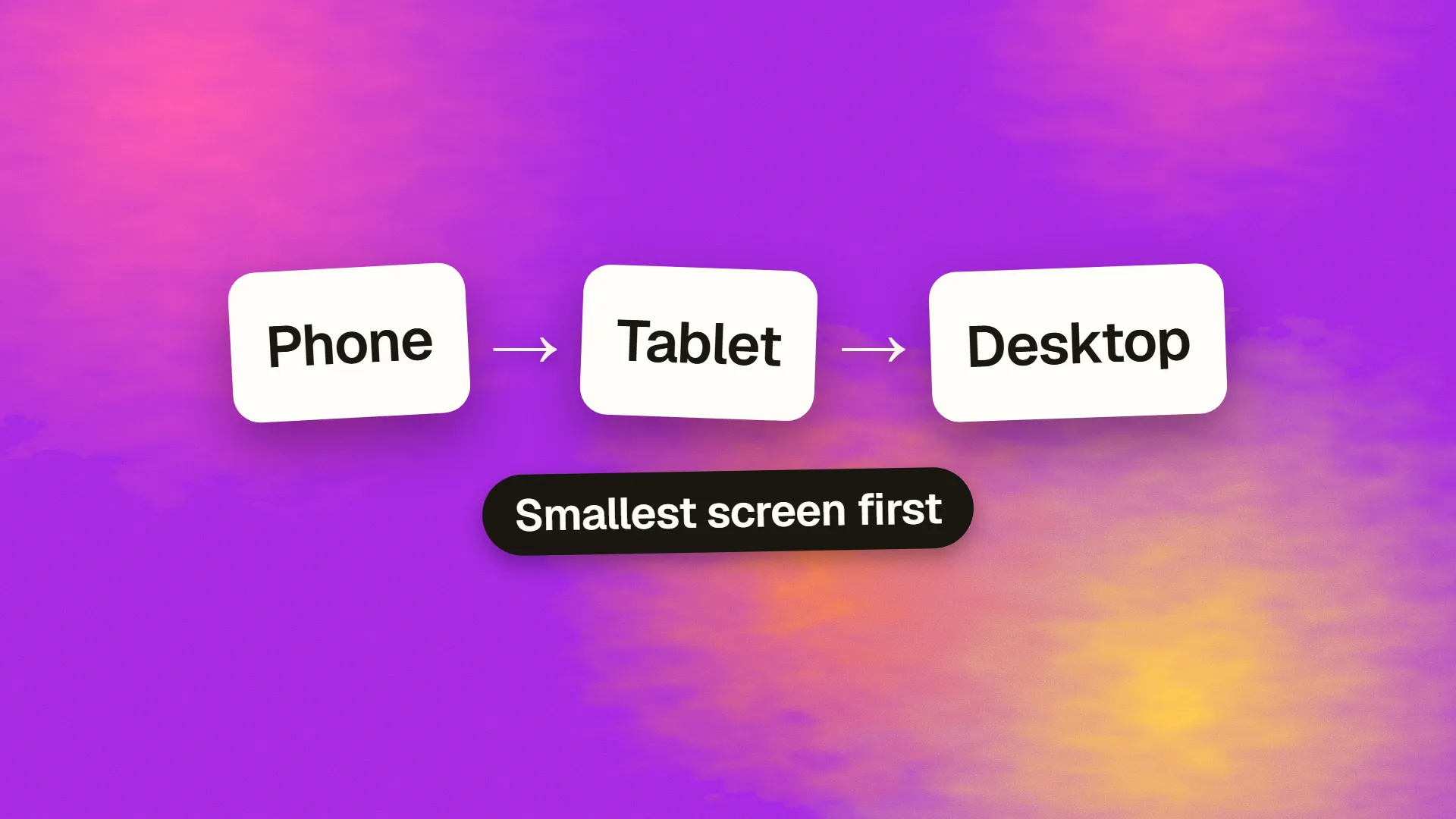
Mobile-first design is the practice of designing an interface for the smallest screen first and then progressively enhancing it for larger ones, rather than designing for desktop and squeezing it down. In CSS it means base styles for small screens with min-width media queries adding layout for larger viewports. It forces decisions about what matters, since a phone screen has no room for the optional, and it tends to produce faster, clearer sites. It does not mean mobile-only or that desktop layouts should look like phones; it means priority is settled on the constrained screen.
The principle
Luke Wroblewski articulated mobile-first in 2009, when phones were becoming the primary way people reached the web and most sites were being shrunk to fit them badly. The argument was twofold. Practically, mobile usage was overtaking desktop, so the phone experience deserved to be the primary design rather than an afterthought. Strategically, the constraints of a small screen force the decisions a larger screen lets a team avoid: what is the one thing this page is for, which three items belong in the navigation, what can be cut. A design that survives those constraints is clearer everywhere.
Google's move to mobile-first indexing, evaluating the mobile version of a site as the primary one, made the practical argument official.
Two meanings
In the design process, mobile-first means the first wireframes and mockups are for a phone. Content is prioritised, navigation is reduced to essentials, and interactions are designed for touch. Then the tablet and desktop layouts are derived by giving the same content more room: columns, sidebars, persistent navigation, larger imagery. Nothing appears on desktop that was not justified on mobile, though it may be presented more generously.
In CSS, mobile-first means the base stylesheet targets small screens, and min-width media queries layer on the changes for larger viewports. A single-column layout is the default; the two-column layout is added at 768 pixels, the three-column at 1024. The alternative, desktop-first, writes the full layout as the base and uses max-width queries to strip it down, which tends to produce more overrides and more CSS that phones download and then discard.
The two meanings reinforce each other, and a project can adopt one without the other, though it is easier to adopt both.
.grid { display: block; }

@media (min-width: 768px) {
  .grid { display: grid; }
}.grid { display: grid; }
@media (max-width: 767px) {
.grid { display: block; }
}Why constraint helps
On a 1,400-pixel screen there is room for the hero, the secondary message, three feature columns, a testimonial, a sidebar of links and a promotional banner, so all of them get in and the page says everything at once. On a 390-pixel screen there is room for one thing at a time, so the team has to decide which thing comes first. That ordering is the page's real information architecture, and mobile-first surfaces it at the start of the project instead of at the end.
The same applies to navigation, where a phone forces the three items that matter to be named; to forms, where every field costs a screen; and to features, where a mobile-first product tends to ship the core and defer the rest.
The performance consequence
A site designed for the small screen first is usually lighter: fewer elements, smaller images by default with larger ones loaded only where needed, less decorative JavaScript. A site designed for desktop and adapted down carries the desktop's weight to every phone and then hides parts of it, which is why so many sites are slow specifically on mobile. Mobile-first CSS also means phones parse only the base rules plus nothing else, rather than the full desktop layout plus the overrides that undo it.
The misreadings
Mobile-only. Mobile-first does not mean desktop is neglected. Desktop users get the same prioritised content with more space, and layouts should use that space well; a phone layout stretched to 1,400 pixels wide is a failure of the second step, not a success of the first.
Hiding content on mobile. The practice is to prioritise, not to remove. Content hidden from phones with display: none is still downloaded, still weighs, and, since Google indexes the mobile version, still absent from what Google reads. If it is not worth showing on mobile, it may not be worth having.
Designing at one phone size. Mobile-first is the start of a continuum, not a target. The layout should work at every width between the smallest phone and the widest monitor, which is what fluid layouts and sensible breakpoints provide.
Assuming mobile means simple tasks. People do complex things on phones. A mobile-first design for a data-heavy product means finding a way to present the complexity on a small screen, not stripping it out.
Mobile-first and responsive design
Responsive design is the technique: one site whose layout adapts to the viewport. Mobile-first is a way of practising it, starting from the small end. A responsive site can be built desktop-first, and many are; mobile-first is the argument that starting small produces better results. Adaptive design, serving different fixed layouts at different sizes, is a third approach that has largely given way to fluid responsive layouts.
When desktop-first is defensible
Internal tools and complex applications used almost entirely at a desk, where the mobile experience is secondary by evidence rather than assumption. Even then, designing the mobile version at all usually improves the desktop one, and the product's marketing site should be mobile-first regardless.
The practical version
Start the design at 375 to 390 pixels. Settle content order, navigation and the primary action there. Widen the canvas and add structure, not content. Write the CSS with small-screen defaults and min-width queries. Test on real phones throughout, not at the end. It is a habit more than a technique, and it is the one that most reliably produces a site that works for the majority of visitors, who are on phones. If you would like a site or product reviewed for how its mobile experience was arrived at, book a call.
Common questions
What does mobile-first design mean?
Designing for the smallest screen first, settling content priority, navigation and the primary action under that constraint, then adding structure for larger screens rather than designing for desktop and shrinking it. In CSS it means small-screen base styles with min-width media queries adding layout for wider viewports.
What is the difference between mobile-first and responsive design?
Responsive design is the technique of one layout that adapts to the viewport. Mobile-first is an approach to practising it, starting from the small screen and enhancing upward. A responsive site can be built desktop-first; mobile-first is the argument that starting small produces clearer priorities and lighter pages.
Why is mobile-first better?
Because the constraint of a phone screen forces decisions about what matters, which produces clearer pages everywhere; because sites built this way carry less weight to phones, where most visitors are; because Google indexes the mobile version first; and because mobile-first CSS gives phones only the rules they need rather than desktop styles plus overrides.
Does mobile-first mean ignoring desktop?
No. Desktop users receive the same prioritised content with more space, and the larger layout should use that space well with columns, persistent navigation and larger imagery. A phone layout merely stretched to a wide screen is a failure of the enhancement step, not an outcome mobile-first recommends.
What is mobile-first CSS?
Writing base styles for small screens, typically a single column, and using min-width media queries to add multi-column layouts, sidebars and larger type at wider breakpoints. The alternative, desktop-first with max-width queries, writes the full layout first and overrides it downward, which usually produces more CSS and more for phones to discard.