In short
Fluid typography is a CSS technique in which font sizes scale continuously between a minimum and a maximum as the viewport width changes, using the clamp() function with a viewport-relative middle value, so that a heading might grow smoothly from 28px on a phone to 48px on a desktop with no breakpoints. It removes awkward jumps and reduces the media queries a type scale needs. The essential rule is to combine the viewport unit with a rem-based term so that text still enlarges when users zoom or set larger default sizes, which pure viewport units break.
The problem it solves
A responsive type scale set with breakpoints has a heading at 28px below 768 pixels and 40px above, and nothing in between. At 767 pixels the heading is small for the space; at 769 it is suddenly large. Adding more breakpoints reduces the jumps at the cost of more rules, and the in-between widths are still compromises.
Fluid typography makes the size a function of the viewport width. Between a chosen minimum and maximum viewport, the size interpolates smoothly; below and above, it is pinned. One declaration replaces the breakpoints, and every width gets a size proportionate to its space.
The clamp() formula
CSS clamp(min, preferred, max) returns the preferred value, constrained between min and max. For fluid type the preferred value mixes a fixed part in rem with a viewport-relative part in vw:
h1 {
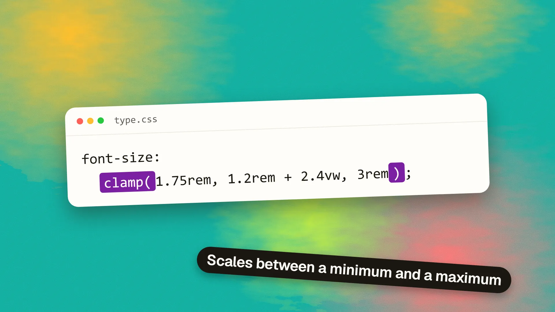
  font-size: clamp(1.75rem, 1.2rem + 2.4vw, 3rem);
}
At narrow widths the expression falls below 1.75rem and is clamped to the minimum; at wide widths it exceeds 3rem and is clamped to the maximum; between, it scales. The coefficients come from choosing the two viewport widths where the size should reach its minimum and maximum, typically around 360px and 1280px, and solving the line through those two points; several free calculators do the arithmetic, and a type scale built as tokens can store one clamp per step.
| Viewport | Computed size |
|---|---|
| 320px | 28px |
| 768px | 38px |
| 1024px | 44px |
| 1280px | 48px |
The same technique applies to spacing: fluid margins, gaps and section padding that grow with the viewport keep the layout's proportions consistent without breakpoints of their own.
Ranges that work
Body text should stay in a narrow band, since readability depends on absolute size more than on proportion: 16 to 18px is typical, and some designs keep body text fixed and make only headings fluid. Headings can range more widely: a display heading from 32px to 64px, a section heading from 24px to 40px. The larger the size, the wider the sensible range, since large type has more room to express scale.
Avoid making the viewport term too large. A heading that grows by more than a few pixels per 100 pixels of width feels as if it is inflating as the window is resized, and it can outrun its container's line length.
The accessibility rule
A size defined purely in viewport units, such as font-size: 4vw, does not respond to browser zoom or to a user's larger default font size, because it is tied to the viewport alone. WCAG requires text to be resizable to 200% without loss of content, and pure viewport sizing fails it. The rem term in the clamp expression is what fixes this: since rem scales with the user's font setting and with zoom, the whole expression scales with them. Always include a rem component, and check that zooming to 200% actually enlarges the text and that the maximum is not so low that zoom is clamped away.
Tooling
Utopia, the fluid type and space calculator, generates a full scale of clamp values from a minimum and maximum viewport and font size. Tailwind and most design-token pipelines can hold clamp values as sizes. Design tools do not yet express fluid sizes natively, so the handoff should specify the minimum and maximum sizes and viewports rather than one fixed value per breakpoint.
When fixed sizes are better
Interface text in applications, where consistency across screens matters more than proportion to viewport, and where a button label should be the same size on a laptop and a large monitor. Small text such as captions and labels, which has little room to scale. Components that appear at many sizes within one page, for which container-relative sizing or fixed sizes per variant are more predictable. And any project where the team is not comfortable reasoning about the formula; a well-chosen set of fixed sizes at three breakpoints is better than a fluid scale nobody understands.
Practical guidance
Make headings and large display text fluid; keep body text fixed or nearly so. Derive the clamp values from a calculator and store them as tokens. Always include a rem term. Test at 200% zoom and with a larger browser default font size. Resize the browser slowly across the range and watch for headings that outgrow their containers. And use fluid spacing alongside fluid type, since a heading that grows while its margins stay fixed looks crowded.
Fluid typography is a small technique with a large effect on how considered a site feels across screens. If yours jumps at the breakpoints, book a call; converting a scale to fluid values is usually an afternoon.
Common questions
What is fluid typography in CSS?
A technique in which font sizes scale smoothly with the viewport width between a minimum and a maximum, using clamp() with a preferred value that combines a rem term and a vw term, instead of jumping between fixed sizes at breakpoints. A heading might grow continuously from 28px on a phone to 48px on a desktop from one declaration.
How do you calculate fluid font size with clamp()?
Choose the minimum and maximum font sizes and the viewport widths at which each should apply, then solve for the line through those two points to get a preferred value of the form a rem + b vw. Wrap it as clamp(min, a rem + b vw, max). Tools such as Utopia and various online calculators produce the values from those four inputs.
Is fluid typography accessible?
Yes, if the preferred value includes a rem term. Sizes set purely in viewport units do not respond to browser zoom or larger default font sizes and fail the requirement that text be resizable to 200%. The rem component makes the expression scale with the user's settings; test at 200% zoom to confirm.
Should body text be fluid?
Only within a narrow range, such as 16 to 18px, or not at all. Readability depends on the absolute size of body text more than its proportion to the screen, so many designs keep body text fixed and make only headings and display text fluid. Small text such as captions should stay fixed.
What is the difference between fluid and responsive typography?
Responsive typography changes size at breakpoints, so there are a few discrete sizes with jumps between them. Fluid typography changes size continuously with the viewport, so every width gets a proportionate size and no breakpoints are needed. Fluid is a way of achieving responsive type with smoother results and fewer rules.