In short
Storybook is an open-source tool that runs a component library in isolation from the application: each component is rendered in a browser workshop through 'stories', small files that show it with specific props and in specific states, so it can be built, reviewed, tested and documented without navigating to the page that uses it. It supports React, Vue, Svelte, Angular, web components and others. Design-system and product teams use it as the shared source of component truth; it adds a maintenance obligation, and small sites with a handful of components do not need it.
What it is
Building a component inside an application means running the whole application, navigating to a screen that uses the component, and contriving the data to reach the state you want to see. An error state on a form three screens into a checkout is slow to reach and easy to leave untested.
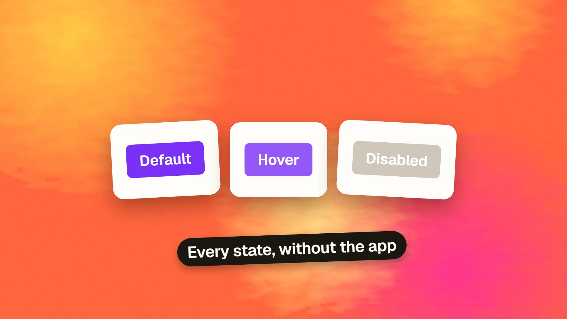
Storybook removes the application from the loop. It renders components on their own, in a browser tool, driven by stories: files that say "here is the Button, primary, disabled" or "here is the ProductCard with a long title and no image". Every state a component can be in becomes a story, all visible in a sidebar, each rendered instantly. The component is developed against its stories, and the stories remain as documentation and as test fixtures.
It began in 2016 for React and now supports every mainstream framework, including web components. It is the default tool for component libraries and design systems in code.
What it enables
Isolated development. Build the component with its props and states in front of you, without the application running. Faster iteration and a natural push toward components that do not depend on global state.
Every-state review. Designers and reviewers see the hover, focus, loading, error, empty, overflow and localisation states side by side, which is how handoff gaps are found before they reach a page.
Documentation. Storybook generates docs pages from the stories and the component's props, with live examples and editable controls, so the component library documents itself and stays current with the code.
Visual regression testing. Tools such as Chromatic, Percy and Storybook's own test runner snapshot every story and flag pixel changes between commits, which catches unintended styling changes across the whole library automatically. This is the visual regression setup most teams use.
Interaction and accessibility testing. Stories can include scripted interactions and assertions, and the accessibility addon runs automated checks on each story, so every component is tested for keyboard and screen-reader basics in the states it actually has.
A shared reference. Product managers, designers, QA and developers look at the same rendered component rather than a mockup, a build and a memory of the spec.
The cost
Storybook is another build, another configuration, another set of files to maintain. Stories go stale if nobody updates them when components change, and a stale Storybook is worse than none because it misleads. It adds setup time to a project, occasionally fights the framework's build configuration, and can become a project of its own for teams that decorate it beyond usefulness. The obligation is real: a team adopts it as it adopts a test suite, with the understanding that it must be kept green.
When it earns its place
A design system used by more than one product or team, where the component library is the product and Storybook is its showroom. A product with dozens of components and many states, where the every-state review and visual testing pay for the upkeep. A team with designers and developers collaborating on components, who need a shared rendered reference. A component library published for others to use, where the generated docs are the documentation.
A typical setup
A component library in Storybook usually has three layers of stories. Foundations show the tokens: every colour, type size and spacing step rendered as a swatch, so the system is visible before any component uses it. Primitives show buttons, inputs, badges and the like, one story per state, with controls that let a reviewer change props live. Composites show cards, forms, navigation and other assemblies, with stories for the awkward cases: long text, missing images, right-to-left languages, the empty list. The stories are written by whoever builds the component and reviewed with the same care as the code, because they are the documentation the next developer will read.
When it does not
A marketing site or a small application with a handful of components, where the states are few and a page renders them all anyway. A solo developer who will not maintain the stories. A project whose components are page-specific and never reused. For these, the overhead outweighs the isolation, and the same discipline of thinking through states can be kept in a simple components page inside the site itself.
Adopting it well
Start with the primitive components, buttons, inputs, typography, and write a story per meaningful state. Wire the design tokens so stories reflect the real theme. Add the accessibility addon from the beginning and treat its findings as failures. Add visual regression testing once the library has a dozen components, so changes are caught automatically. Make writing the story part of the definition of done for any new component. And review the Storybook in design critiques, since a rendered component in every state is the most honest artefact a team has.
If you are starting a design system and want Storybook set up with tokens, accessibility checks and visual testing from the first component, book a call.
Common questions
What is Storybook used for?
Building, reviewing, testing and documenting UI components in isolation from the application. Each component is rendered in a browser workshop through stories that show it in specific states, so designers and developers can see every state at once, documentation is generated from the stories, and visual regression and accessibility tests run against them automatically.
What is a story in Storybook?
A small file that renders one component with specific props and in a specific state: a primary button, a disabled button, a product card with a long title and no image. Each story appears in Storybook's sidebar, renders instantly, and doubles as documentation and as a fixture for visual and interaction tests.
Does Storybook work with Vue, Svelte or plain HTML?
Yes. Storybook supports React, Vue, Svelte, Angular, web components, plain HTML and several other frameworks through renderers. The workflow of writing stories, reviewing states, generating docs and running tests is the same across them.
Is Storybook worth it for a small project?
Usually not for a marketing site or a small application with a handful of components, where the overhead of another build and stories to maintain outweighs the isolation. It earns its place for design systems shared across products, applications with many components and states, and libraries published for others to use.
How does Storybook help with testing?
Stories are fixtures: visual regression tools such as Chromatic and Percy snapshot every story and flag pixel changes between commits; the accessibility addon runs automated checks on each story; and interaction tests can script clicks and assertions inside stories. Every component is tested in every state it actually has, without navigating the application.