In short
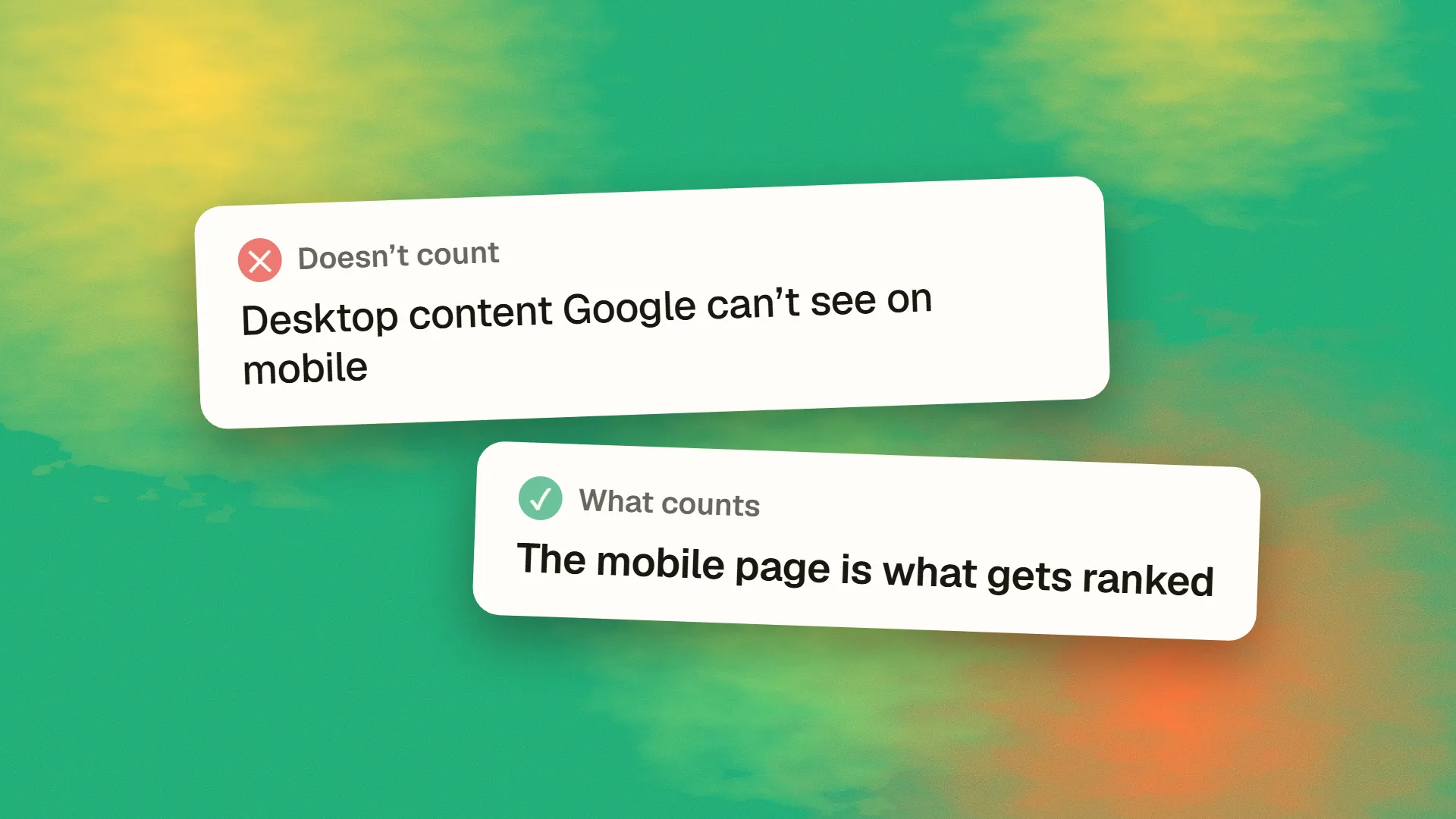
Mobile-first indexing is Google's practice, rolled out from 2018 and completed for all sites by 2023, of using the mobile version of a page, as fetched by a smartphone crawler, as the version it indexes and ranks. Content, links, structured data and metadata that exist only on the desktop version are not seen. Responsive sites that serve the same content at every width are unaffected; sites that hide, truncate or omit content on mobile, or serve a separate reduced mobile site, lose whatever is missing. Check with Search Console's URL Inspection, which shows the smartphone crawler's view.
What changed
For most of its history, Google crawled the desktop version of a page and ranked from that, while a growing majority of searches came from phones that often saw a different, reduced version. In 2016 Google announced it would reverse this, and between 2018 and 2023 it moved every site to mobile-first indexing: Googlebot Smartphone fetches the page, and what it receives is what goes into the index.
The practical statement: there is one index, it is built from the mobile version of each page, and the desktop version is not consulted for ranking. A site with identical content at every width notices nothing. A site with a thinner mobile experience is ranked on the thinner experience.
What Google evaluates on mobile
Everything it used to evaluate on desktop, from the mobile page: the text content and its headings; internal and external links; images and their alt text; structured data; title and meta tags; canonical and hreflang tags; and page experience, meaning Core Web Vitals measured on mobile, usability on a small screen, and the absence of intrusive interstitials. Speed on mobile, in particular, has moved from a nice-to-have to the thing Google measures, which is why sites that are slow on phones specifically underperform.
The content-parity requirement
Google's guidance is that the mobile and desktop versions should contain the same primary content, the same structured data, the same metadata and the same links. Common ways sites violate this:
Hiding content on mobile. Sections removed at small widths with display: none are still in the HTML and Google reads them, but content that is genuinely omitted from the mobile version, through a separate template or conditional rendering, is gone. Content in accordions and tabs on mobile is fine; Google indexes collapsed content, though it may weight visible content slightly more.
Truncated text. "Read more" that loads the rest through a request Google does not make. Load the full text and truncate visually, or ensure the expansion is in the HTML.
Fewer links. Mobile navigation with a subset of the desktop menu, or related-content modules omitted on phones, reduces the internal links Google follows.
Missing structured data or metadata on the mobile template, common on older separate-mobile-site setups.
Lazy-loaded content that requires interaction. Images and content that load only on scroll or tap, where Googlebot does not scroll or tap. Use native lazy loading or ensure content is present without interaction.
Separate mobile sites on an m-dot subdomain, which must mirror the desktop site exactly and declare the relationship with canonical and alternate tags. Google recommends responsive design instead, and most m-dot sites have been retired.
| On desktop only | Does Google see it? |
|---|---|
| A section hidden at small widths | Not if it is removed from the page |
| Text behind a "Read more" request | Not if it needs an interaction to load |
| Links missing from the mobile menu | No |
| Responsive site, same HTML everywhere | Yes, nothing to do |
Images and video
Images on the mobile version must be the ones that should rank in image search, with alt text, at adequate quality, and referenced in a way Googlebot can fetch; images loaded only by JavaScript after scroll are missed. Video should be embedded with structured data on the mobile page. Some sites serve tiny placeholder images to mobile and full images to desktop, which puts the placeholders in Google's index.
Checking what Googlebot sees
Search Console's URL Inspection tool fetches with the smartphone crawler and shows the rendered HTML and a screenshot. Compare it with the desktop page: is the content all there, are the links present, is the structured data detected? The Pages report and the Core Web Vitals report are both mobile by default. A site crawler configured with a mobile user agent shows the same view at scale. And the simplest check, opening the site on a phone and looking for what the desktop site has that the phone does not, catches most of it.
The myths
"Google will index desktop if mobile is poor." No. The switch is complete; the smartphone crawler is what there is.
"Mobile-first indexing means mobile-first ranking boost." It means the mobile version is what is ranked, not that mobile-friendly sites rank higher for being mobile-friendly, though page experience on mobile is a signal.
"Responsive sites need to do something." A responsive site that serves the same content at every width already complies. The work is for sites that treat mobile as a reduced version.
"Desktop no longer matters." Desktop users still exist and still convert; the desktop experience matters for them. It simply is not what Google indexes.
The practical rule
Serve the same content, links, structured data and metadata at every width, with a responsive layout that reflows rather than removes. Make the mobile version fast. Check the smartphone crawler's view for key templates. Sites built mobile-first satisfy this by construction, which is another argument for the approach. If your rankings fell when you cannot see why and the mobile site shows less than the desktop one, book a call; parity problems are usually a template fix.
Common questions
What does mobile-first indexing mean?
That Google crawls the mobile version of a page with its smartphone crawler and uses that version for indexing and ranking, rather than the desktop version. Content, links, structured data and metadata present only on desktop are not seen. The switch began in 2018 and was completed for all sites by 2023.
Does mobile-first indexing affect desktop rankings?
Rankings on all devices are derived from the mobile version of the page, so a mobile version missing content ranks worse everywhere, including desktop searches. The desktop experience still matters for desktop visitors, but it is not what Google indexes.
Is content hidden in accordions on mobile indexed?
Yes. Google indexes content present in the HTML even when collapsed in accordions or tabs on mobile, and has said this is acceptable for mobile-first indexing. Content that is genuinely omitted from the mobile template, or loaded only after a tap that Googlebot does not make, is not indexed.
Do I need a separate mobile site for mobile-first indexing?
No, and Google recommends against it. A responsive site serving the same content at every width complies automatically. Separate m-dot mobile sites must mirror the desktop site exactly and declare the relationship with canonical and alternate tags, and most have been retired in favour of responsive design.
How do I check what Googlebot sees on mobile?
Use Search Console's URL Inspection tool, which fetches with the smartphone crawler and shows the rendered HTML, a screenshot, detected structured data and any blocked resources. Compare against the desktop page for missing content, links or metadata, and crawl the site with a mobile user agent to check at scale.